
Mai's ice cream

Brand Identity

Crafting the vision for a local business with a modern approach

Time: 1 month
Role: Graphic Designer
Client: Small-scale local business

Share

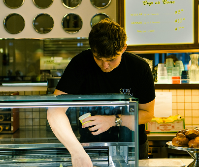
Ice cream shop employee wearing a white apron featuring the Mai’s Ice Cream logo in a warm, softly blurred interior.

project overview

Through this project, I was tasked with developing a brand of my choice from the ground up. I created a fictional local ice cream shop and developed its complete visual identity system. The project involved several stages, including naming, research, competitive analysis, establishing an appropriate brand position, and designing the visual identity.

Afterward, I expanded the project by creating visual narratives for the same fictional client. I also evaluated, applied, and documented the brand identity in a comprehensive visual style guide. Finally, I designed corporate event graphics for the organization to further extend the brand across different applications.

BUSINESS
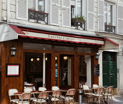
Charming Parisian café storefront with red awnings, wooden doors, and outdoor bistro seating along the sidewalk.Interior of an artisanal ice cream shop with a tiled counter, handwritten flavor boards, waffle cones, and staff working behind the counter.Ice cream shop employee serving from a display case, with menu boards, cups, and pastries visible in the background.Gelato display case featuring assorted flavors, including butter pecan, almond pistachio, and strawberry, labeled with handwritten flavor signs.

Mai’s Ice Cream is a modern Vietnamese-style ice cream shop located in downtown Chicago. As a new startup, the company is seeking a fresh and professional brand identity. The shop positions itself as a high-end destination, offering excellent service and premium, handcrafted recipes inspired by Vietnamese traditions and reinterpreted with a modern sensibility. This blend of heritage and contemporary aesthetics reflects the evolving culture and artistic expression of the digital age. The primary target audience is urban adults aged 18 to 55 who have a strong appreciation for the arts and frequently visit museums and cultural venues in downtown Chicago. Mai’s Ice Cream aspires to be recognized as one of the city’s best small-size, high-end ice cream shops. Its premium pricing strategy reinforces its commitment to consistent quality and an elevated customer experience.

inspiration
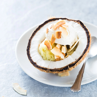
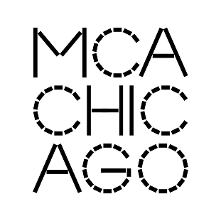
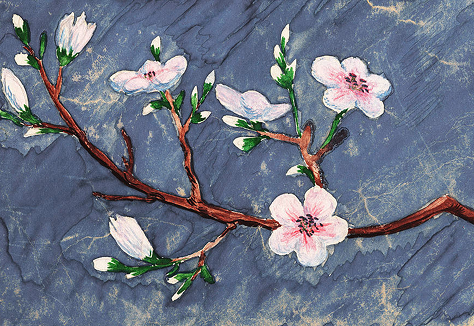
Coconut ice cream served inside a halved coconut shell, topped with toasted coconut flakes and presented on a white plate.Art Institute of Chicago logo in white uppercase lettering on a deep red background.MCA Chicago logo featuring stylized black geometric lettering arranged in a square composition on a white background.Painting of a flowering tree branch with delicate white and pink blossoms against a textured blue-gray background.Abstract painting with swirling red, orange, and yellow brushstrokes surrounding a bright glowing center.

My design is inspired by the iconic Vietnamese coconut ice cream as well as the art museums in downtown Chicago. 
During the brand development process, I defined key brand personalities based on these inspirations: artsy, romantic, premium, modern, and urban. I then worked to capture and simplify the pattern of coconut meat in a way that reflects these qualities.

process
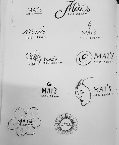
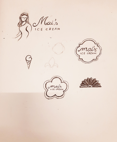
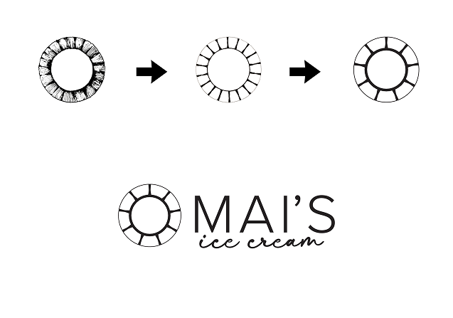
Hand-drawn Mai’s Ice Cream logo explorations featuring script and serif wordmarks, floral symbols, an ice cream cone, circular motifs, and a profile illustration.Early logo concept sketches for Mai’s Ice Cream, featuring handwritten wordmarks, floral badge shapes, an ice cream cone, and decorative graphic motifs.Mai’s Ice Cream logo development showing the refinement of a circular sunburst-style symbol from sketch to final mark, paired with the finished wordmark.

brand style guide manual
Mai’s Ice Cream brand style guide cover featuring the white logo and ‘brand style guide manual’ title on a dark brown background.
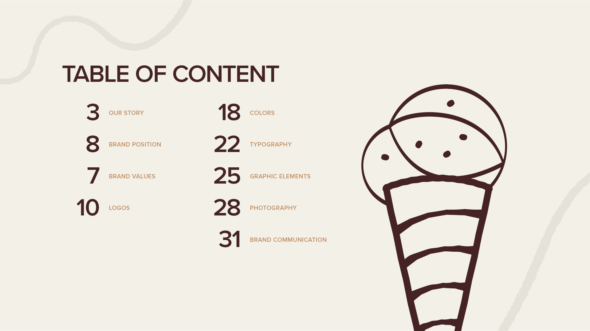
Mai’s Ice Cream brand style guide table of contents, listing sections for brand story, values, logos, colors, typography, graphic elements, photography, and communication beside an illustrated ice cream cone.
Mai’s Ice Cream brand style guide ‘Our Story’ section opener with large cream typography, floral graphics, and circular brand elements on a dark brown background.
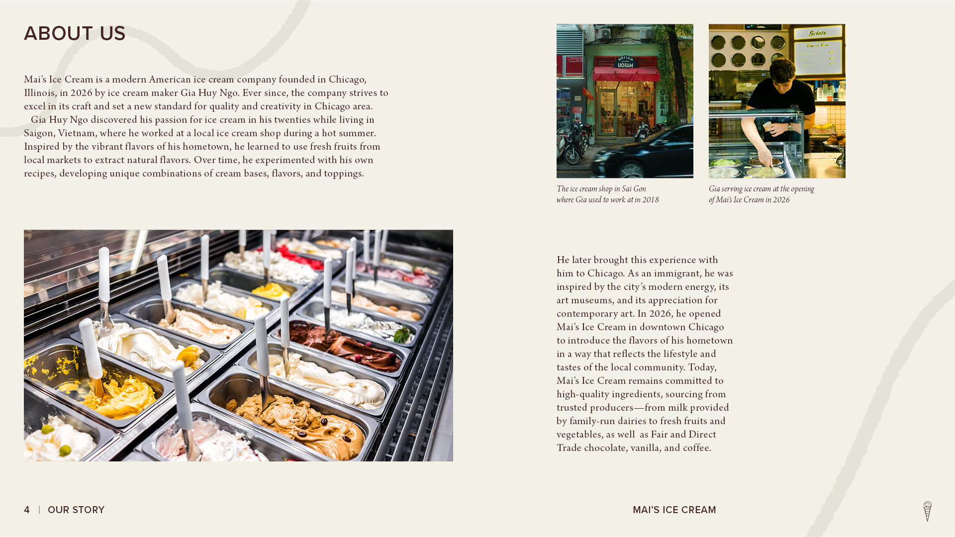
Mai’s Ice Cream brand style guide ‘About Us’ spread featuring company history, founder background, storefront and staff photos, and a large image of assorted ice cream flavors.
Mai’s Ice Cream brand style guide ‘Brand Position’ section opener with large cream typography, floral graphics, and curved brand elements on a dark brown background
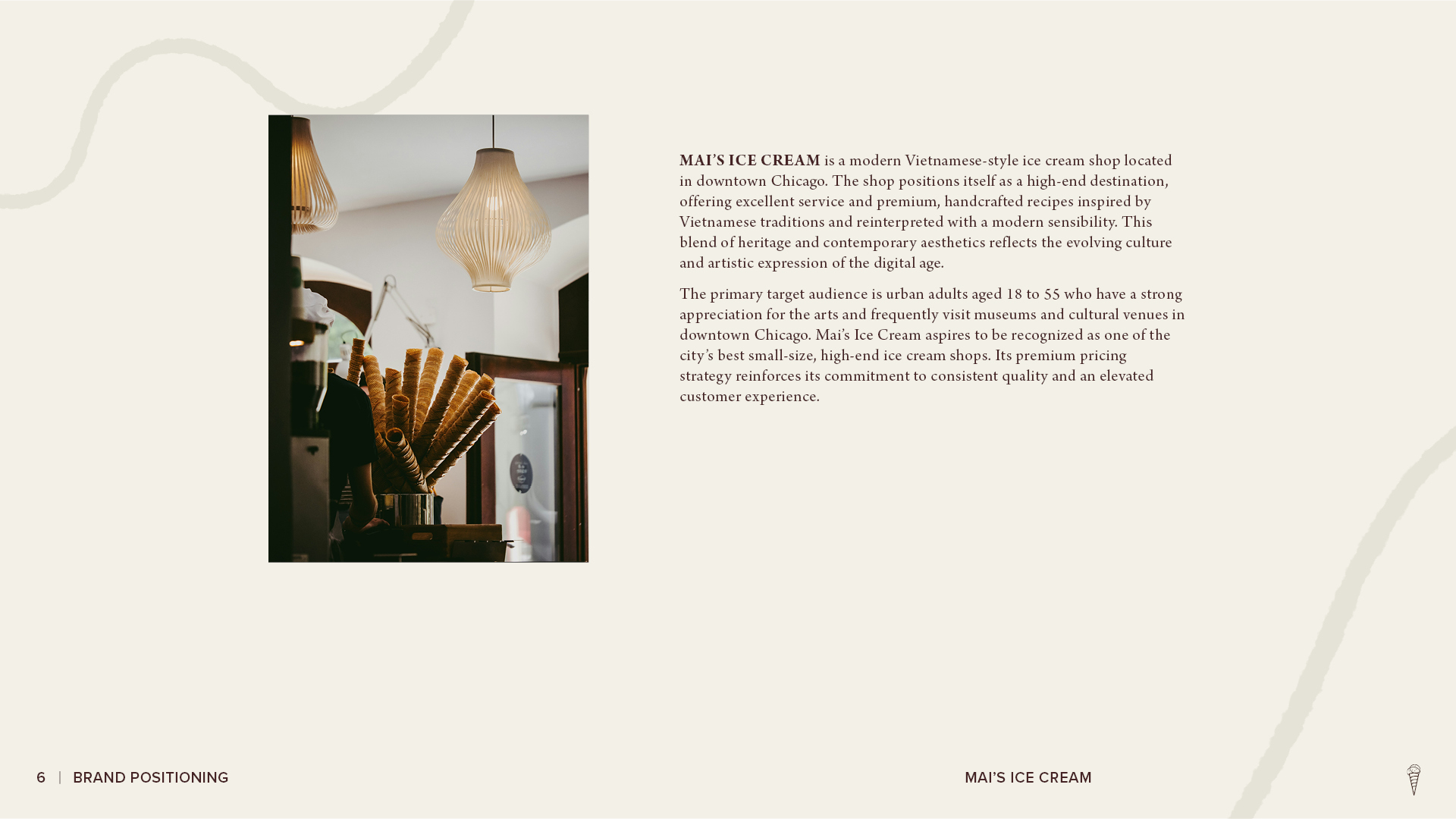
Mai’s Ice Cream brand positioning page featuring a shop interior photo with stacked waffle cones and text describing the brand’s market position, target audience, and premium customer experience.
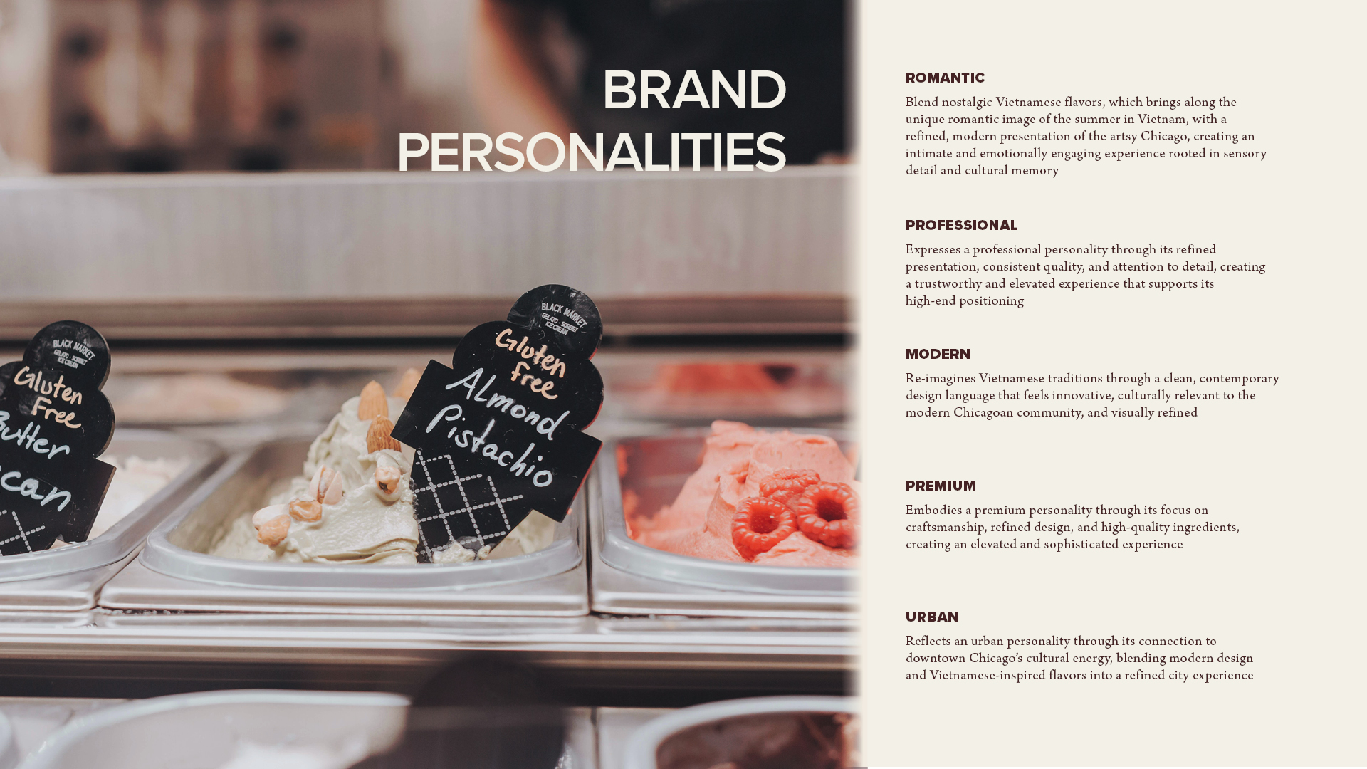
Gelato display case featuring assorted flavors, including butter pecan, almond pistachio, and strawberry, labeled with handwritten flavor signs.
Mai’s Ice Cream brand style guide ‘Brand Values’ section opener with large cream typography, floral graphics, and curved brand elements on a dark brown background.
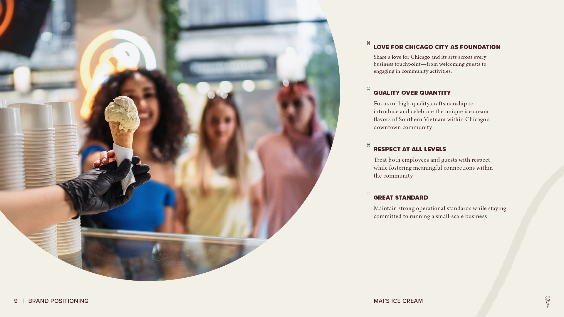
Mai’s Ice Cream brand values page featuring an employee serving an ice cream cone to customers alongside principles focused on Chicago community, quality, respect, and high standards.
Mai’s Ice Cream brand style guide ‘Logos’ section opener with large cream typography, floral graphics, and curved brand elements on a dark brown background.
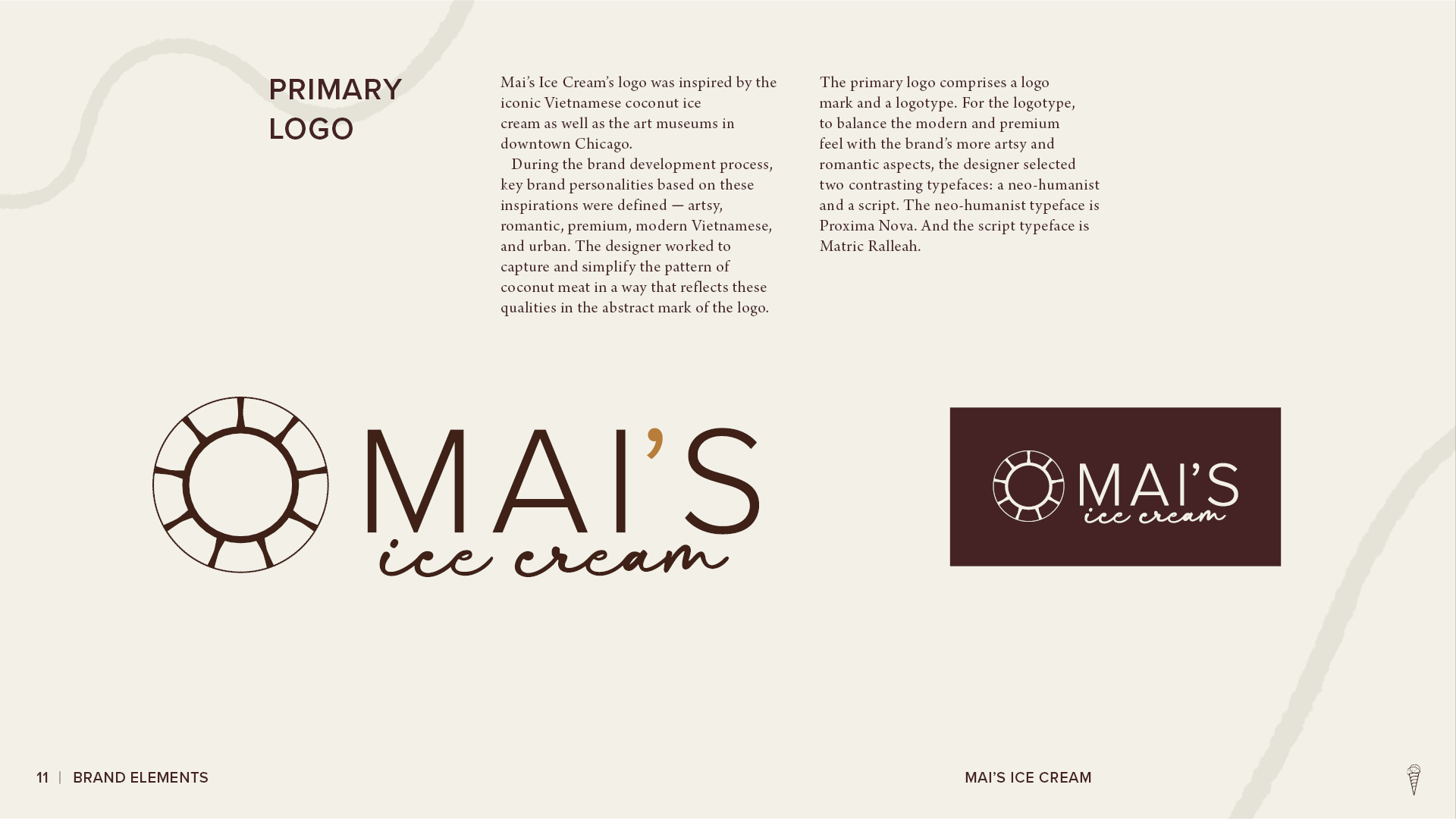
Mai’s Ice Cream primary logo page showing the logo concept, typography rationale, and primary logo variations in brown and cream.
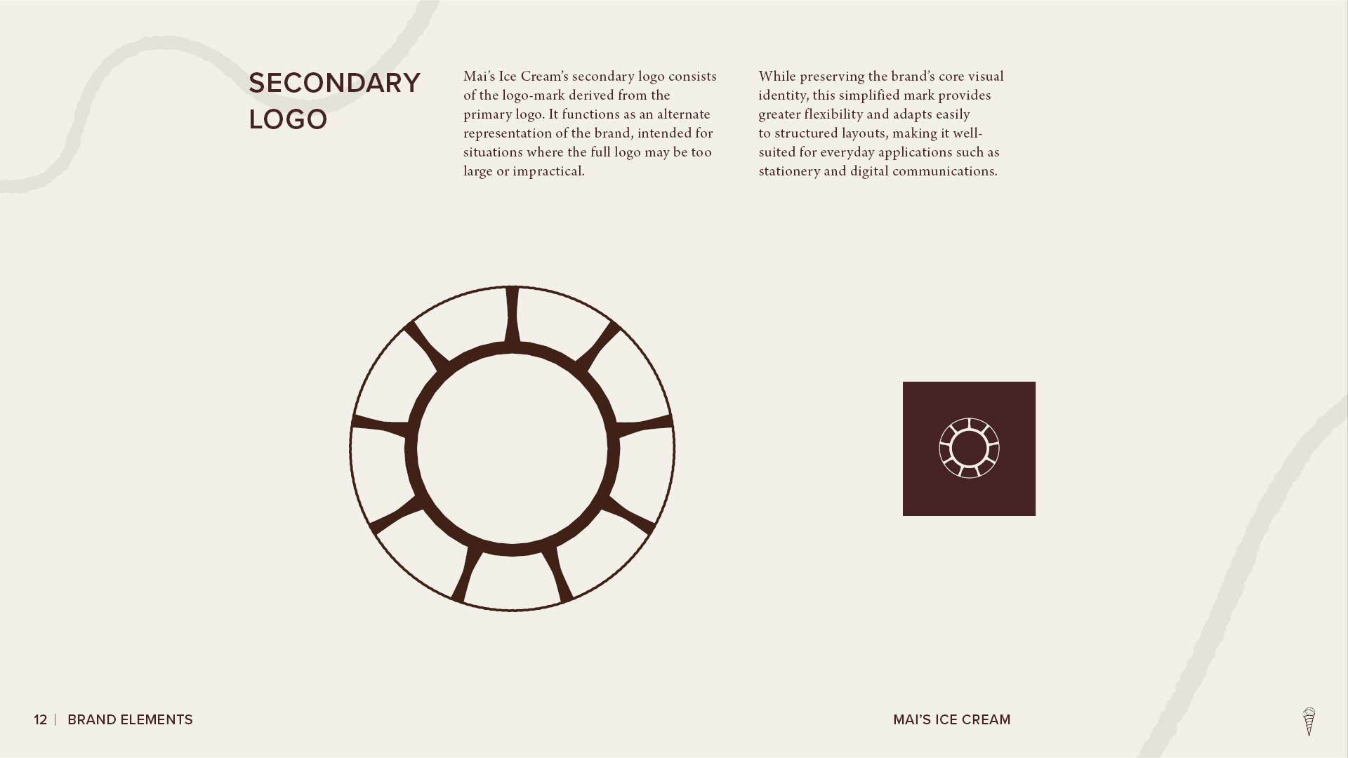
Mai’s Ice Cream secondary logo page showing the circular brand mark, its simplified application, and a reversed version on a dark brown background.
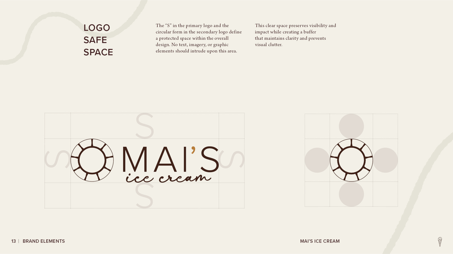
Mai’s Ice Cream logo safe-space guidelines showing spacing rules around the primary wordmark and circular secondary mark using proportional reference guides.
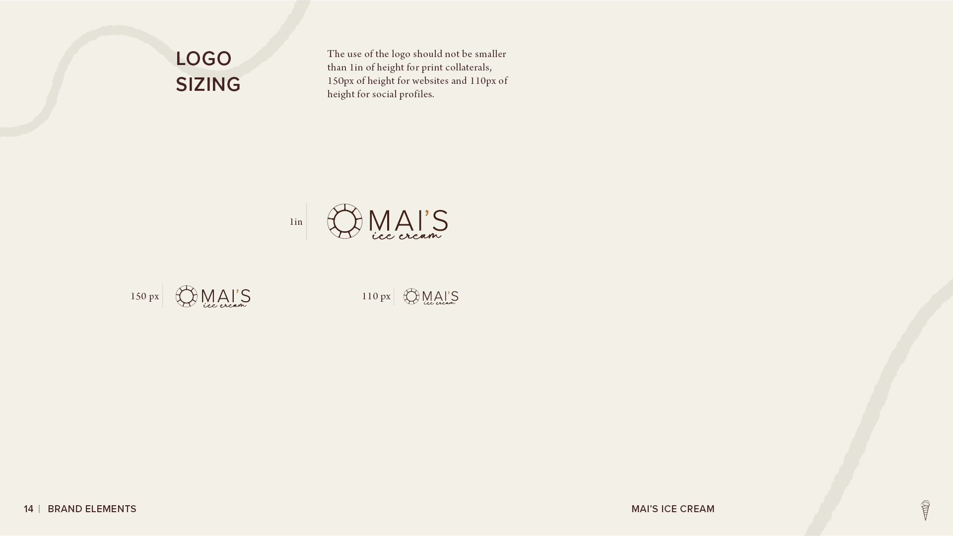
Mai’s Ice Cream logo sizing guidelines showing recommended minimum logo dimensions for print, website, and social media applications.
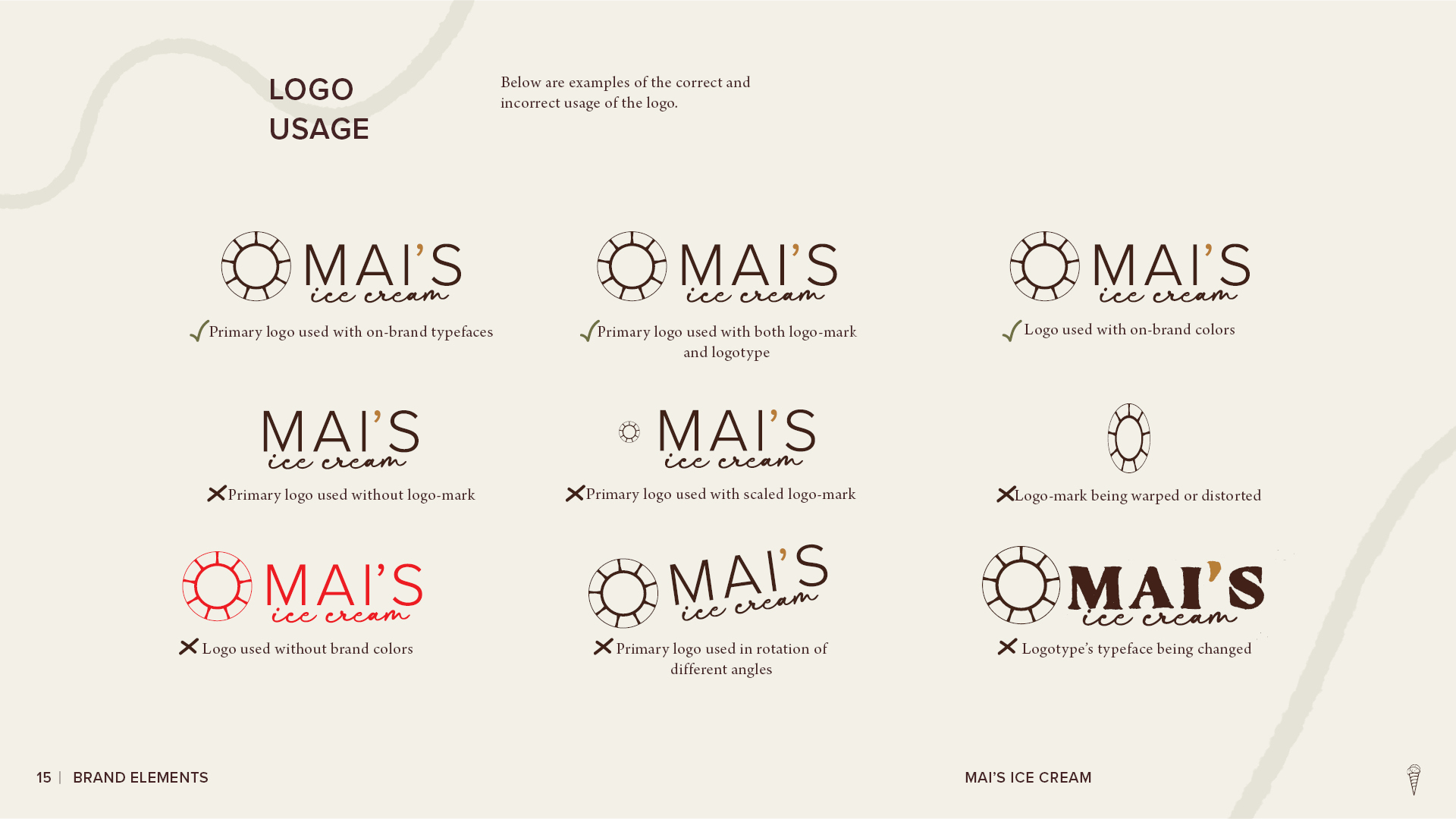
Mai’s Ice Cream logo usage guidelines showing correct and incorrect applications of the logo, including approved colors, proportions, orientation, and typography.
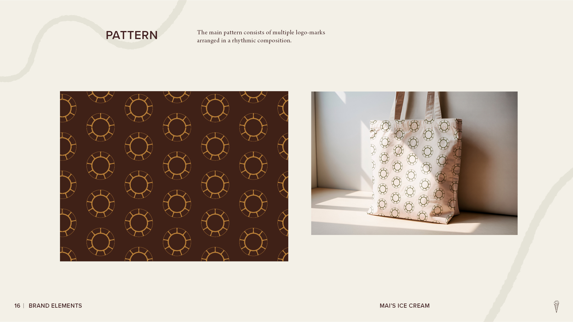
Mai’s Ice Cream brand pattern page showing a repeating circular logo motif and a tote bag mockup featuring the pattern.
Mai’s Ice Cream brand style guide ‘Colors’ section opener with large cream typography, floral graphics, and curved brand elements on a dark brown background.
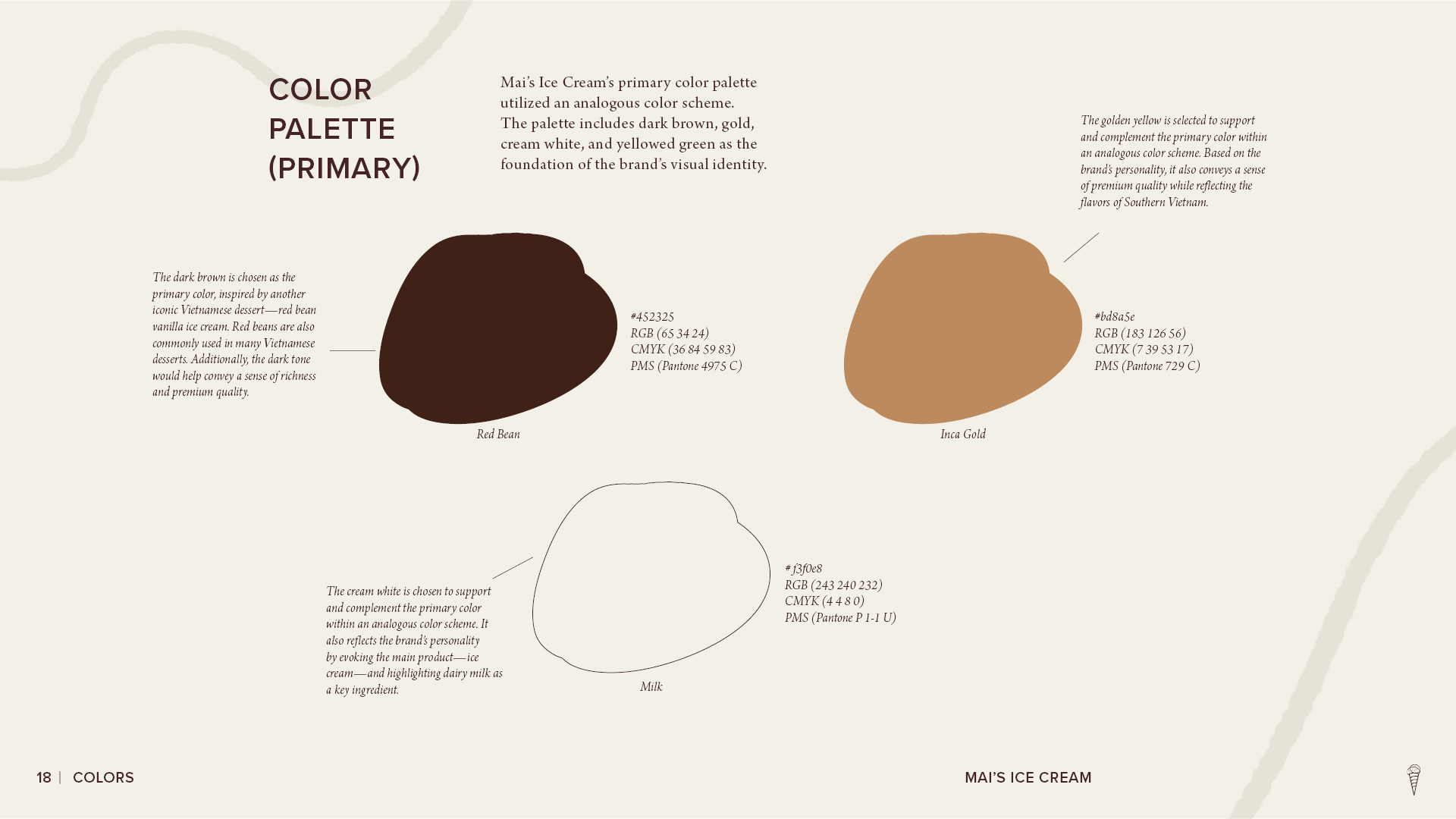
Mai’s Ice Cream primary color palette page showing the brand’s dark brown, gold, and cream colors with color codes and notes explaining their visual role.
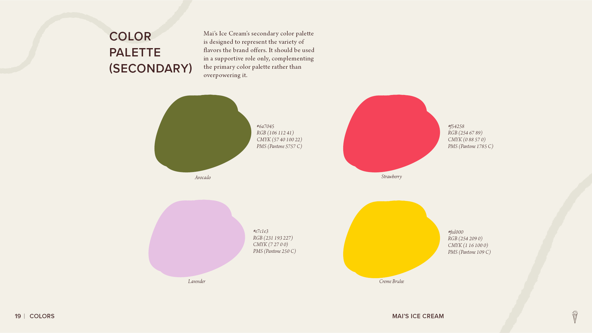
Mai’s Ice Cream secondary color palette page showing avocado green, strawberry red, lavender, and crème brûlée yellow with color codes for each accent color.
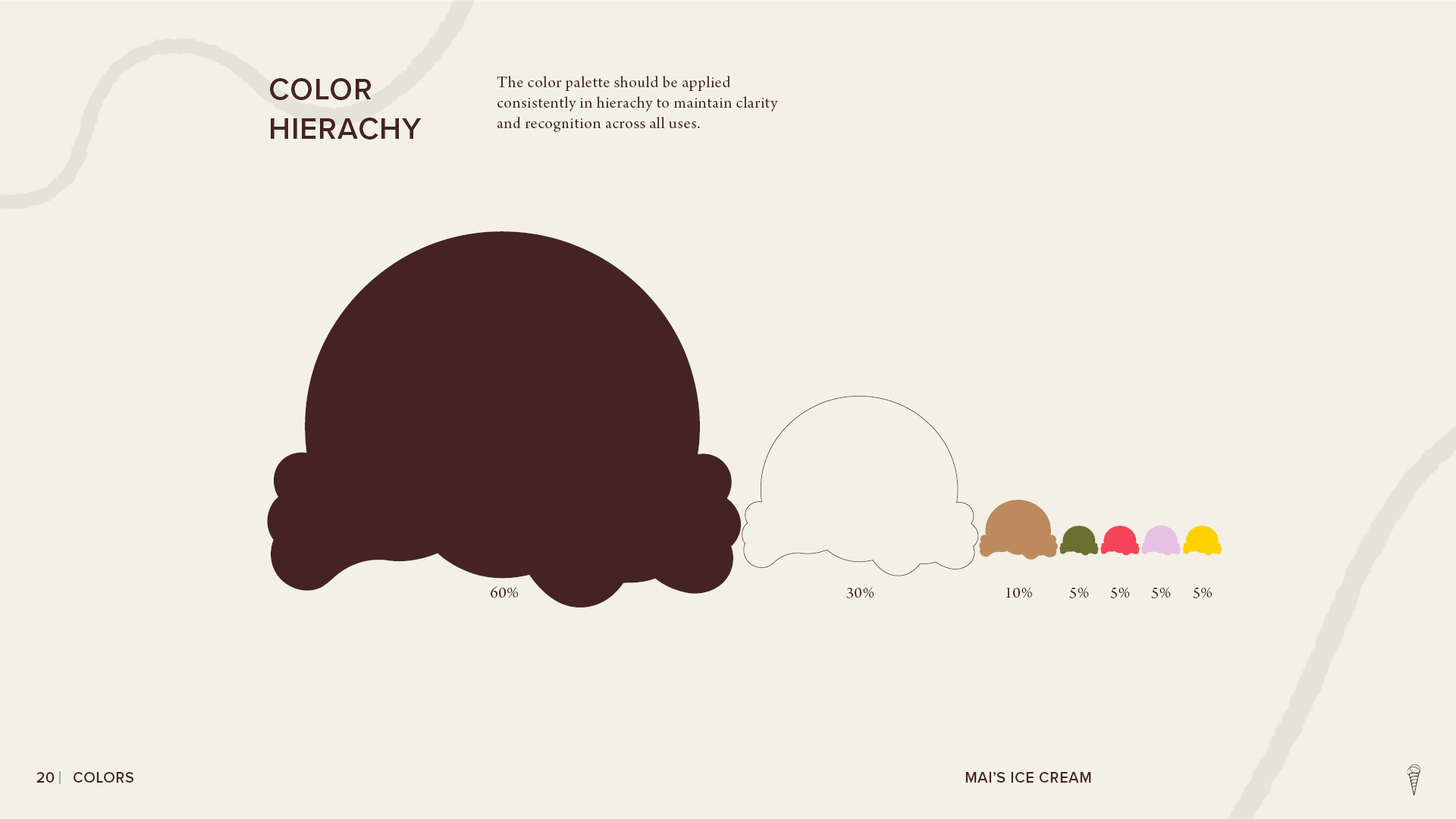
Mai’s Ice Cream color hierarchy page showing the recommended proportion of primary and secondary brand colors, led by dark brown and cream with smaller accent colors.
Mai’s Ice Cream brand style guide ‘Typography’ section opener with large cream lettering, floral graphics, and curved brand elements on a dark brown background
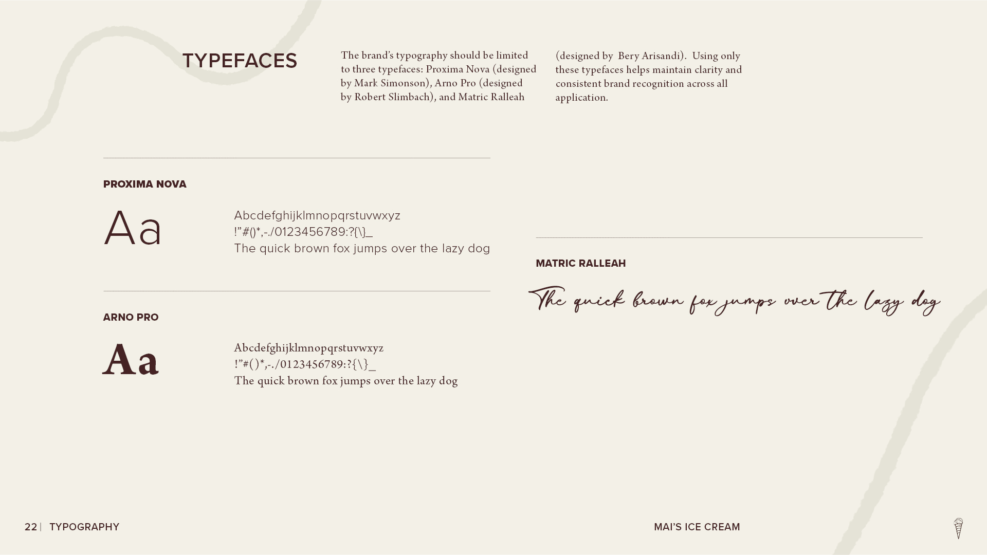
Mai’s Ice Cream typography page presenting the brand’s selected typefaces—Proxima Nova, Arno Pro, and Matric Ralleah—with sample letterforms and text.
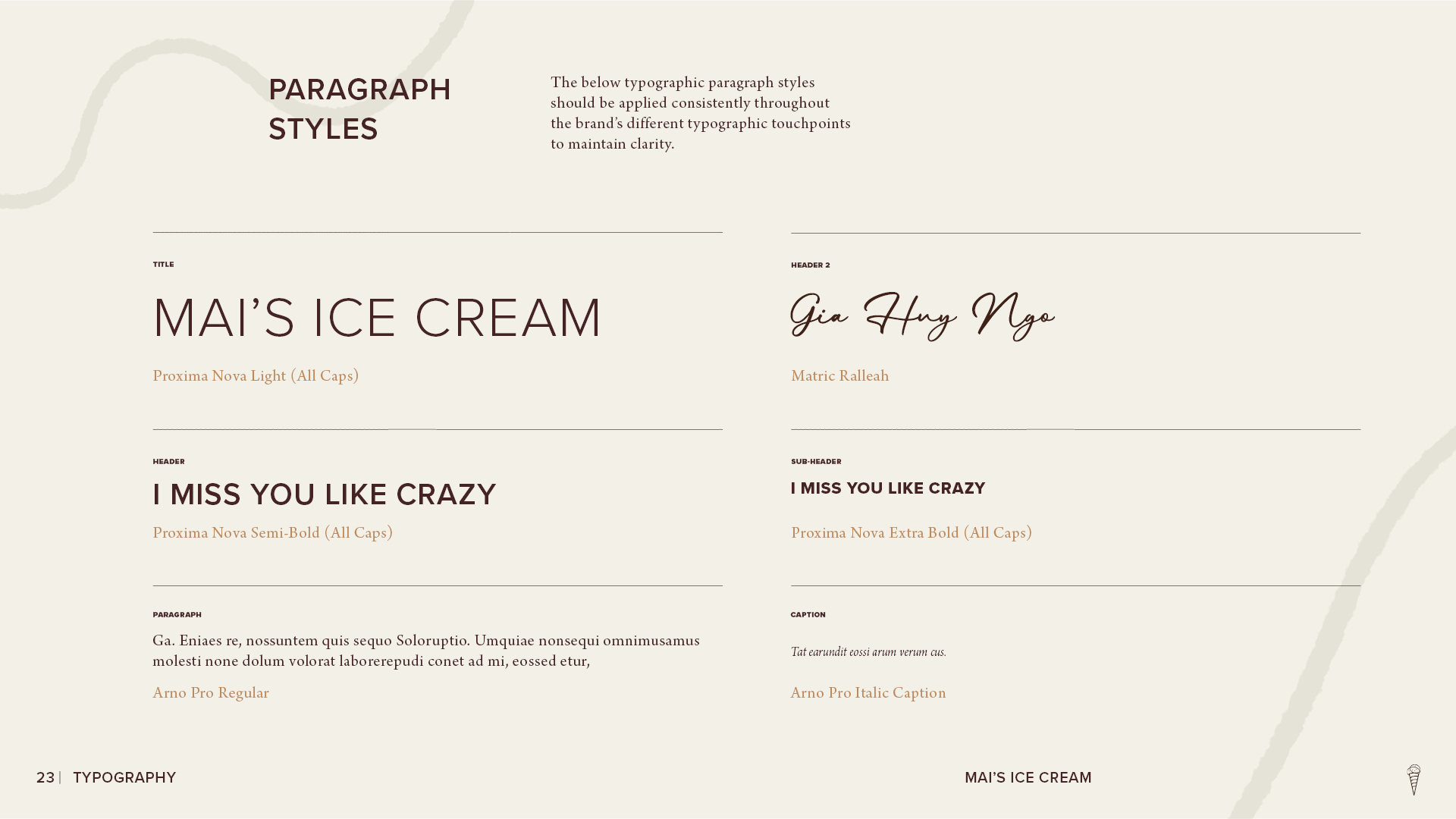
Mai’s Ice Cream paragraph styles page showing the brand’s typography hierarchy for titles, headers, subheaders, body text, and captions using its selected typefaces.
Mai’s Ice Cream brand style guide ‘Graphic Elements’ section opener with large cream typography, floral graphics, and curved brand elements on a dark brown background.
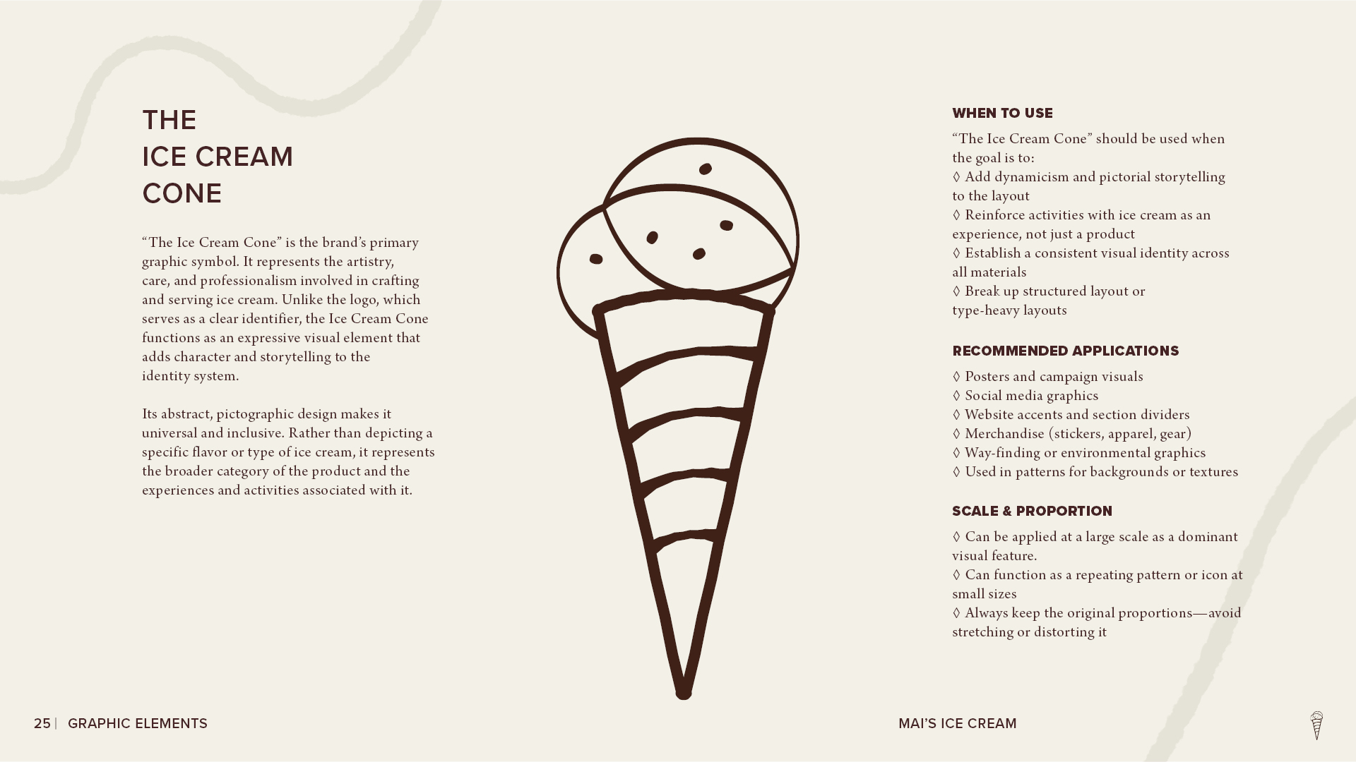
Mai’s Ice Cream graphic element page featuring a stylized ice cream cone illustration with guidelines for its purpose, recommended applications, scale, and proportion.
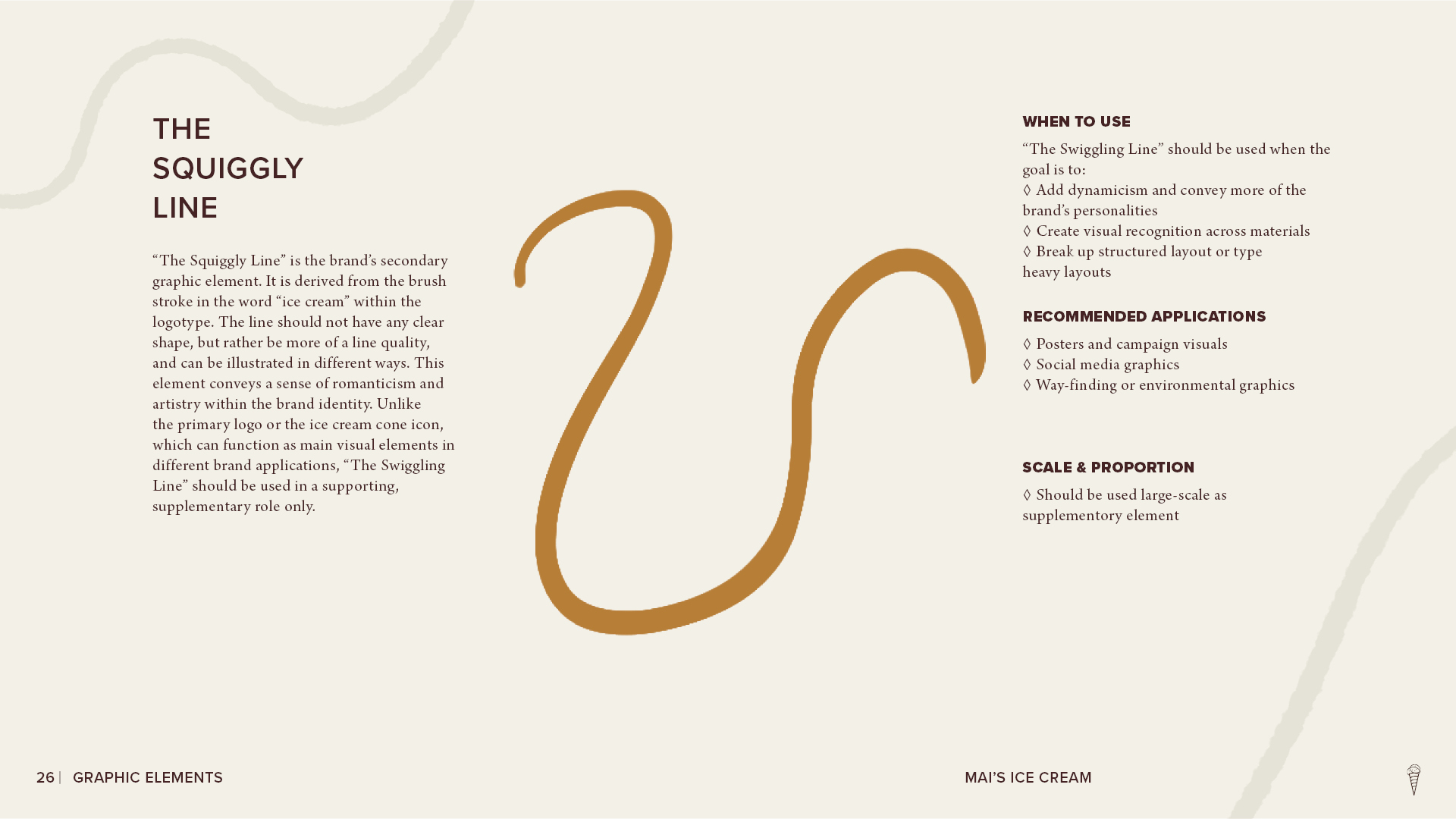
Mai’s Ice Cream graphic element page featuring the brand’s gold squiggly line motif with guidance for its purpose, recommended applications, and scale.
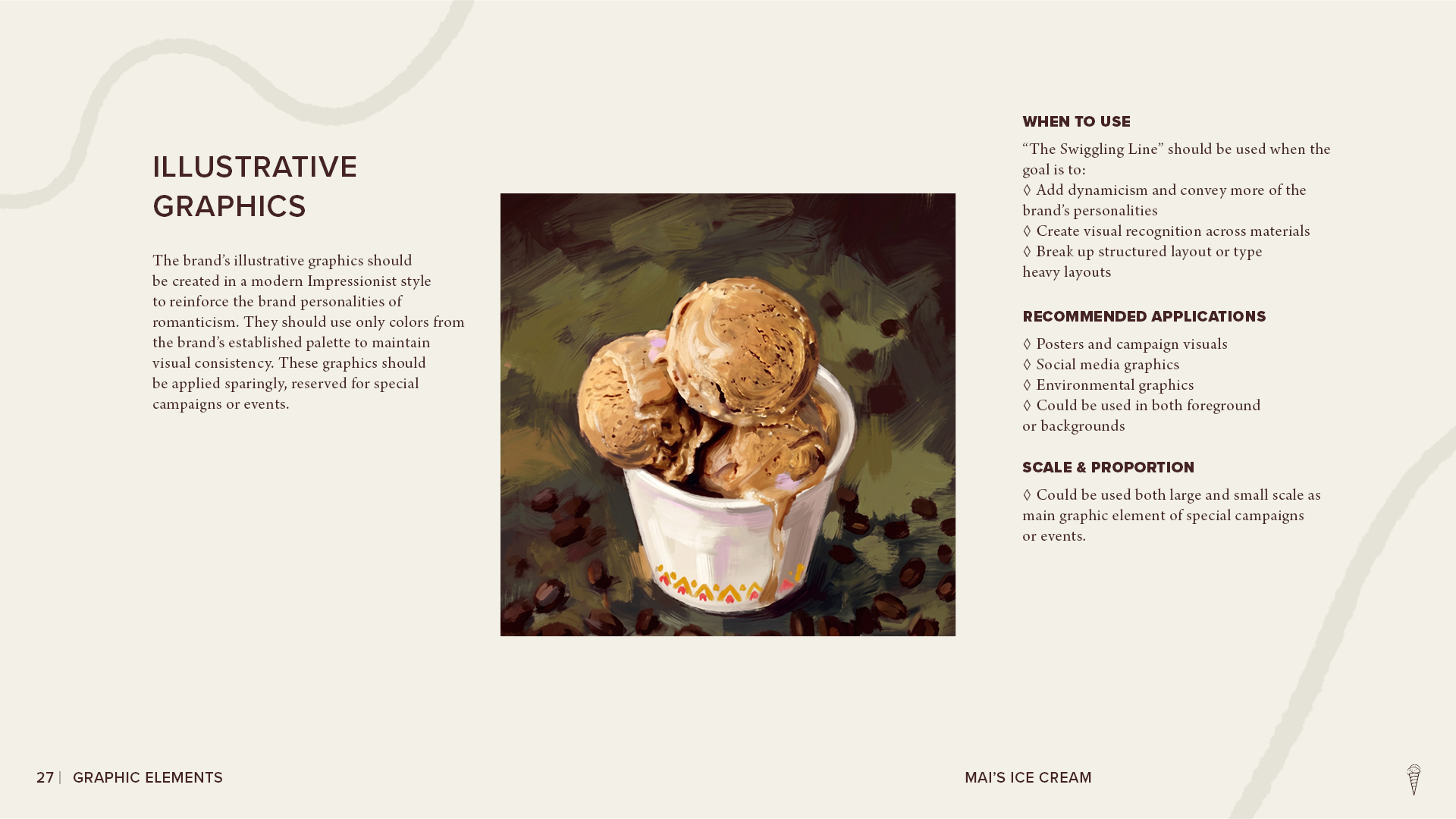
Mai’s Ice Cream illustrative graphics page featuring a painterly image of scoops of ice cream in a cup, with guidelines for style, applications, and scale.
Mai’s Ice Cream brand style guide ‘Photography’ section opener with large cream typography, floral graphics, and curved brand elements on a dark brown background.
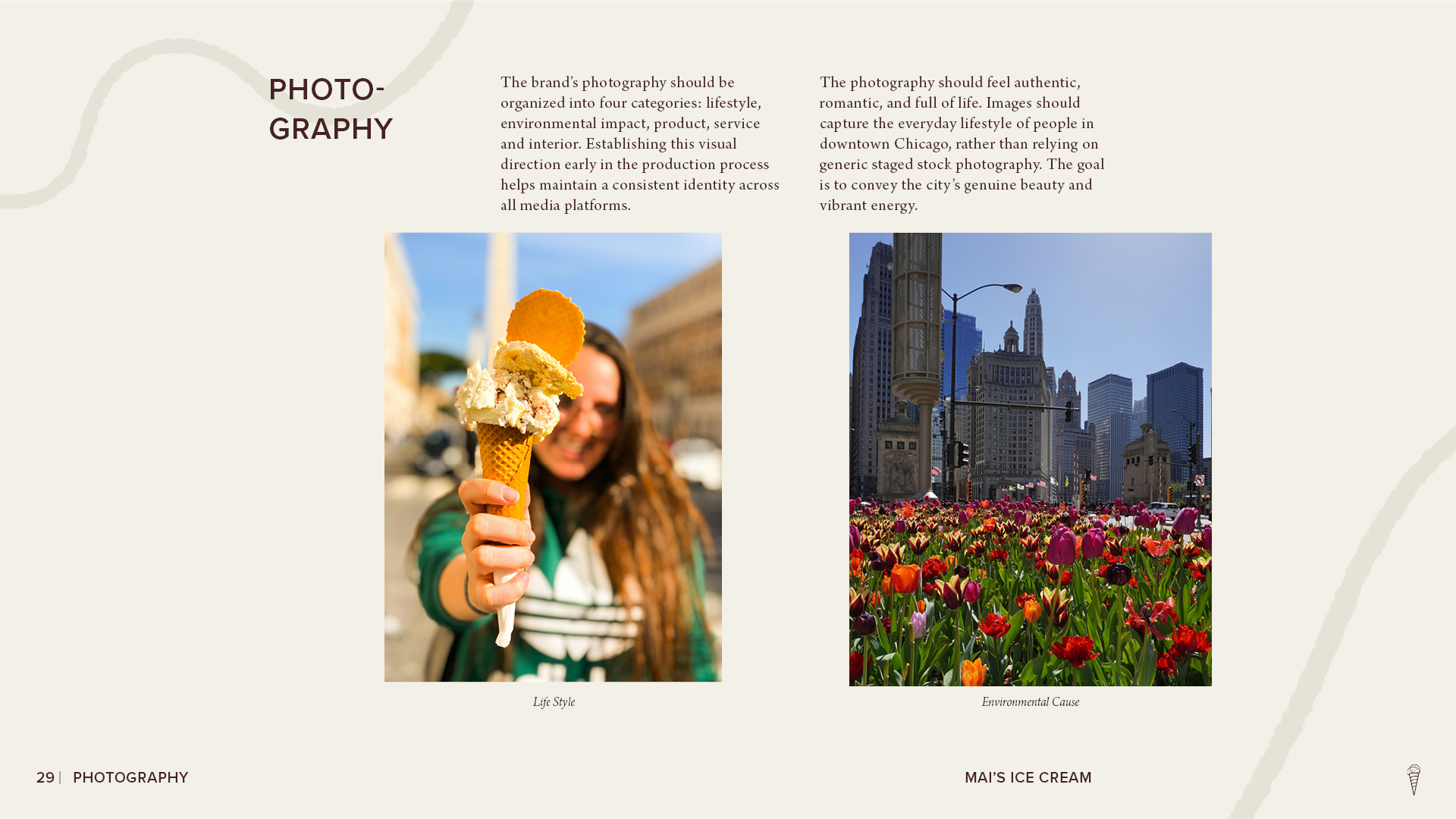
Mai’s Ice Cream photography guidelines page featuring lifestyle imagery of a person holding an ice cream cone and an environmental photo of downtown Chicago with colorful tulips.
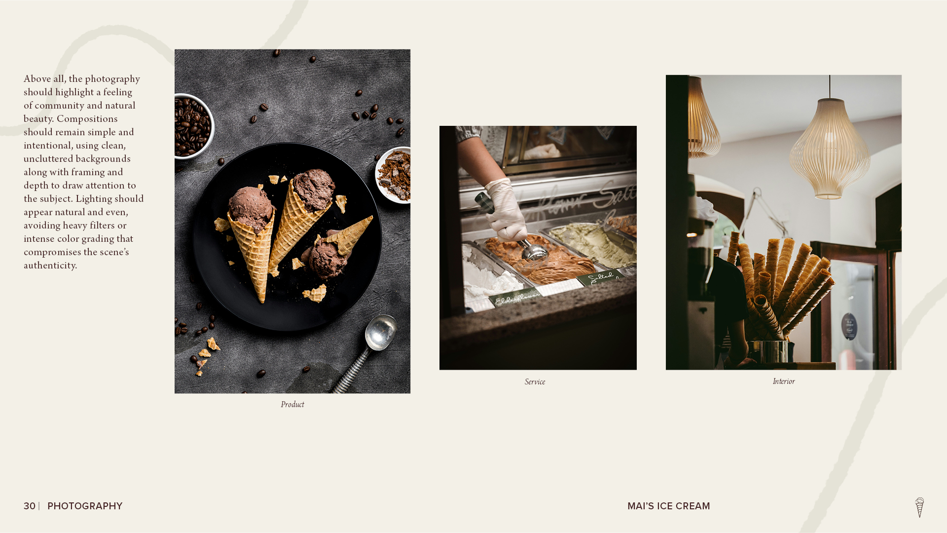
Mai’s Ice Cream photography guidelines page showing product, service, and interior imagery, including chocolate ice cream cones, gelato being served, and stacked waffle cones inside the shop.
Mai’s Ice Cream brand style guide ‘Brand Communication’ section opener with large cream typography, floral graphics, and curved brand elements on a dark brown background.
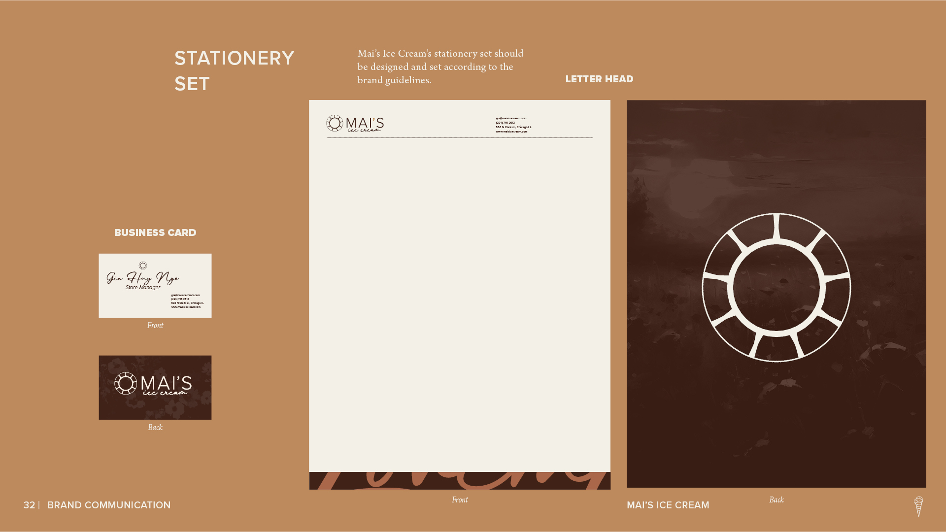
Mai’s Ice Cream stationery set page showing branded business cards and letterhead designs in cream, brown, and gold.
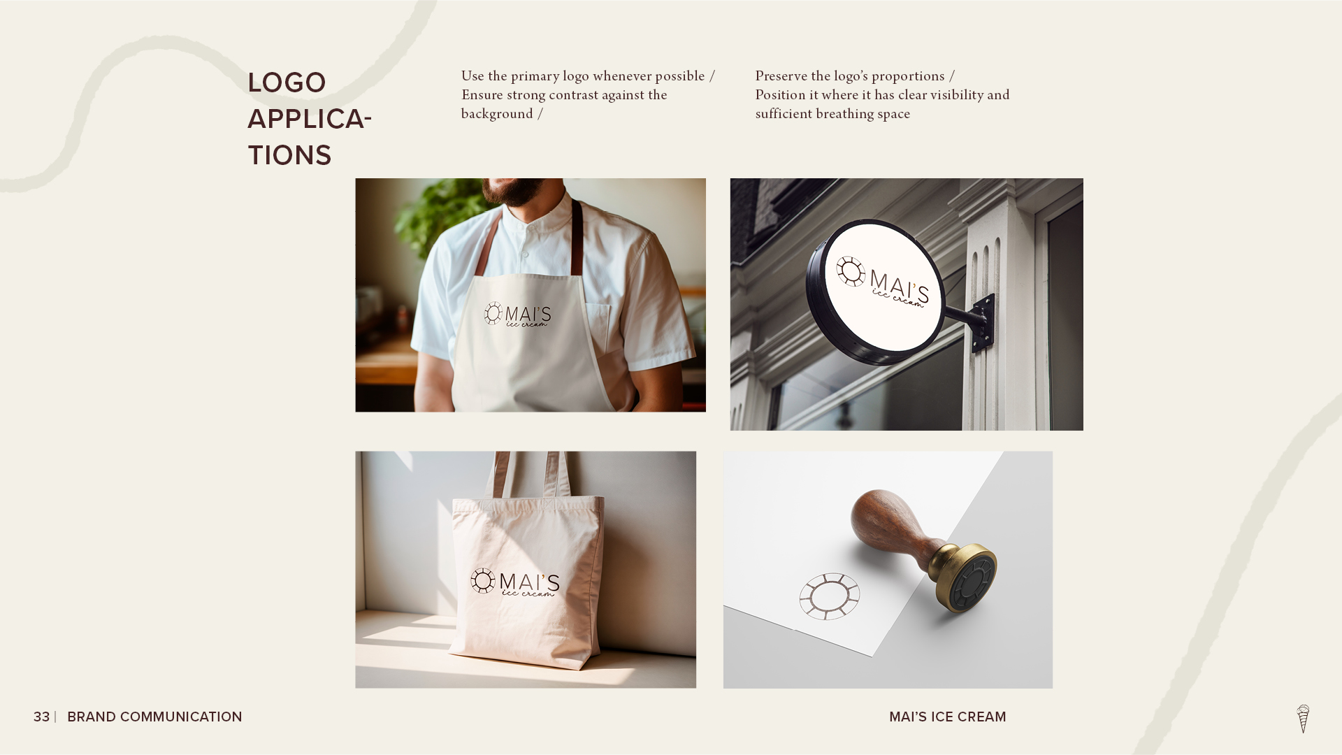
Mai’s Ice Cream logo applications page showing the brand mark applied to an employee apron, storefront sign, tote bag, and stationery stamp.
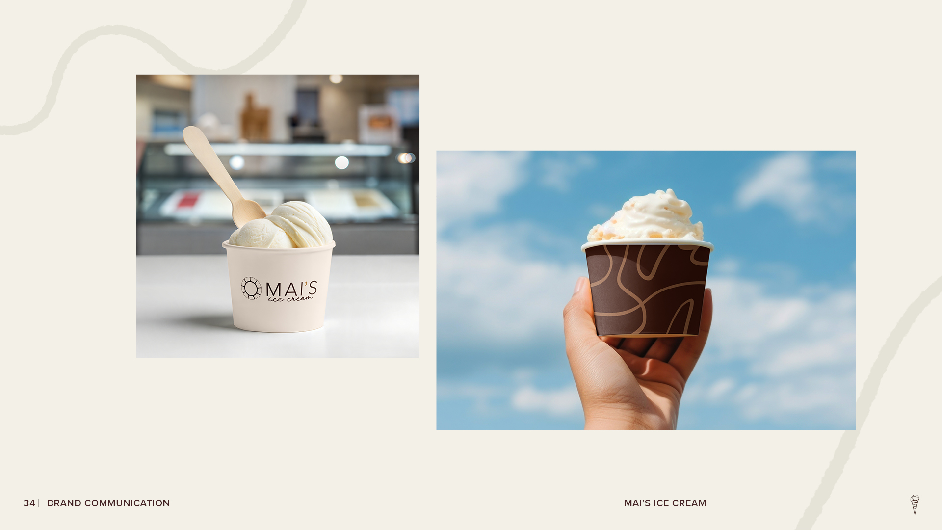
Mai’s Ice Cream brand application page showing two branded ice cream cups—one on a shop counter and one held outdoors against a blue sky.
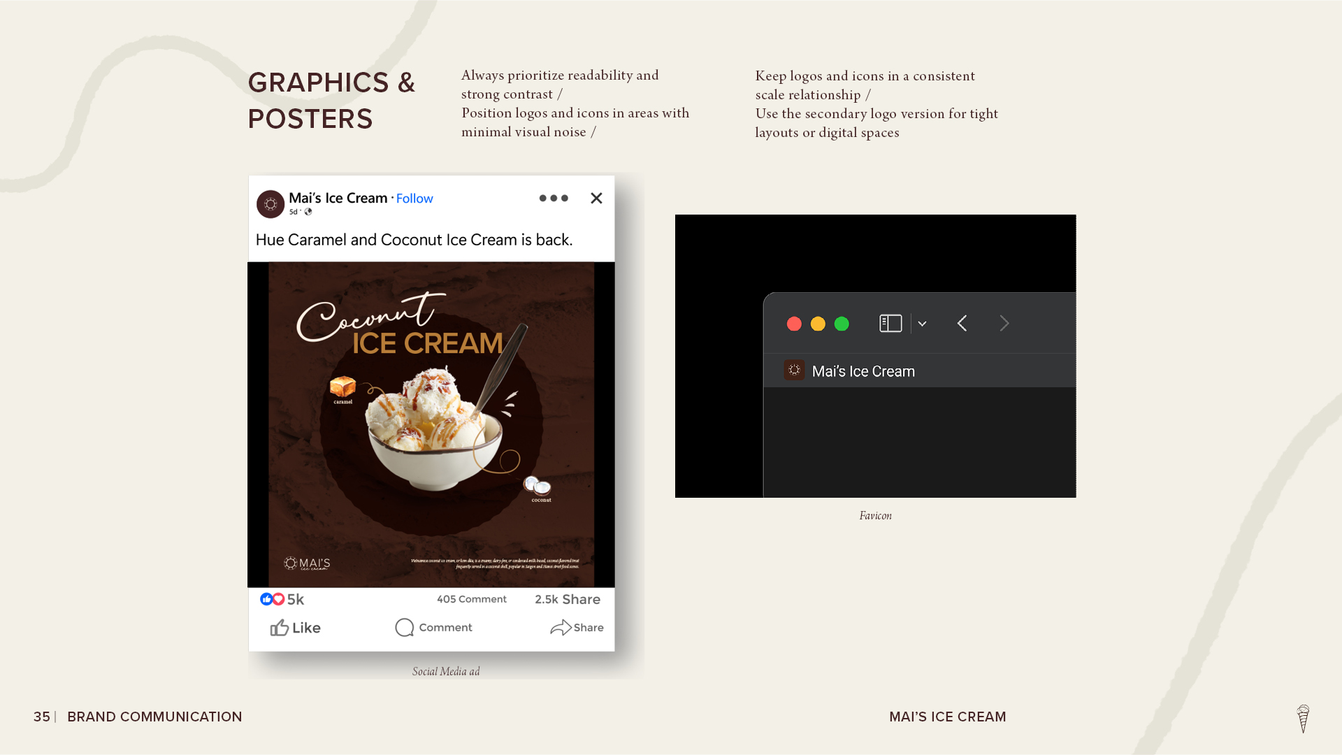
Mai’s Ice Cream graphics and posters page showing a branded social media ad for coconut ice cream and a browser favicon example.
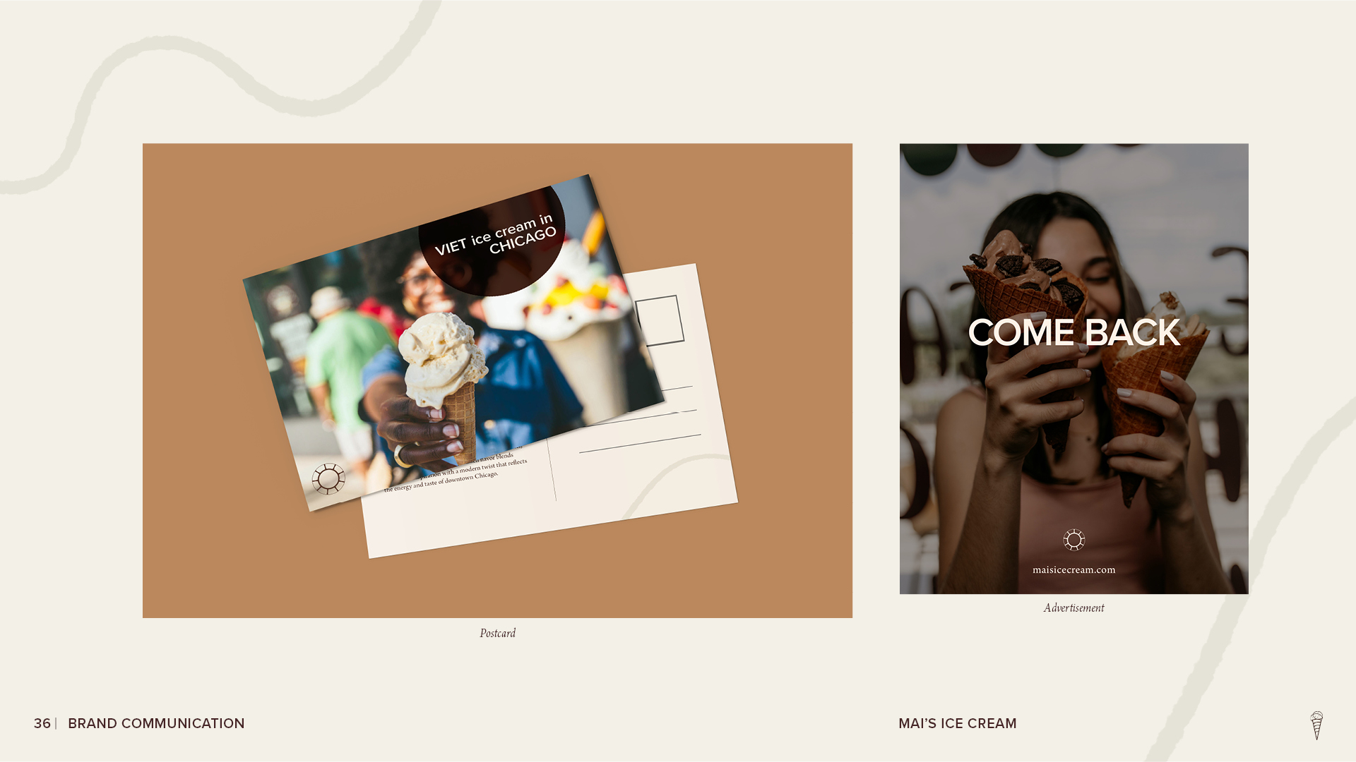
Mai’s Ice Cream brand communication page showing a branded postcard design and a promotional advertisement featuring customers holding ice cream cones.
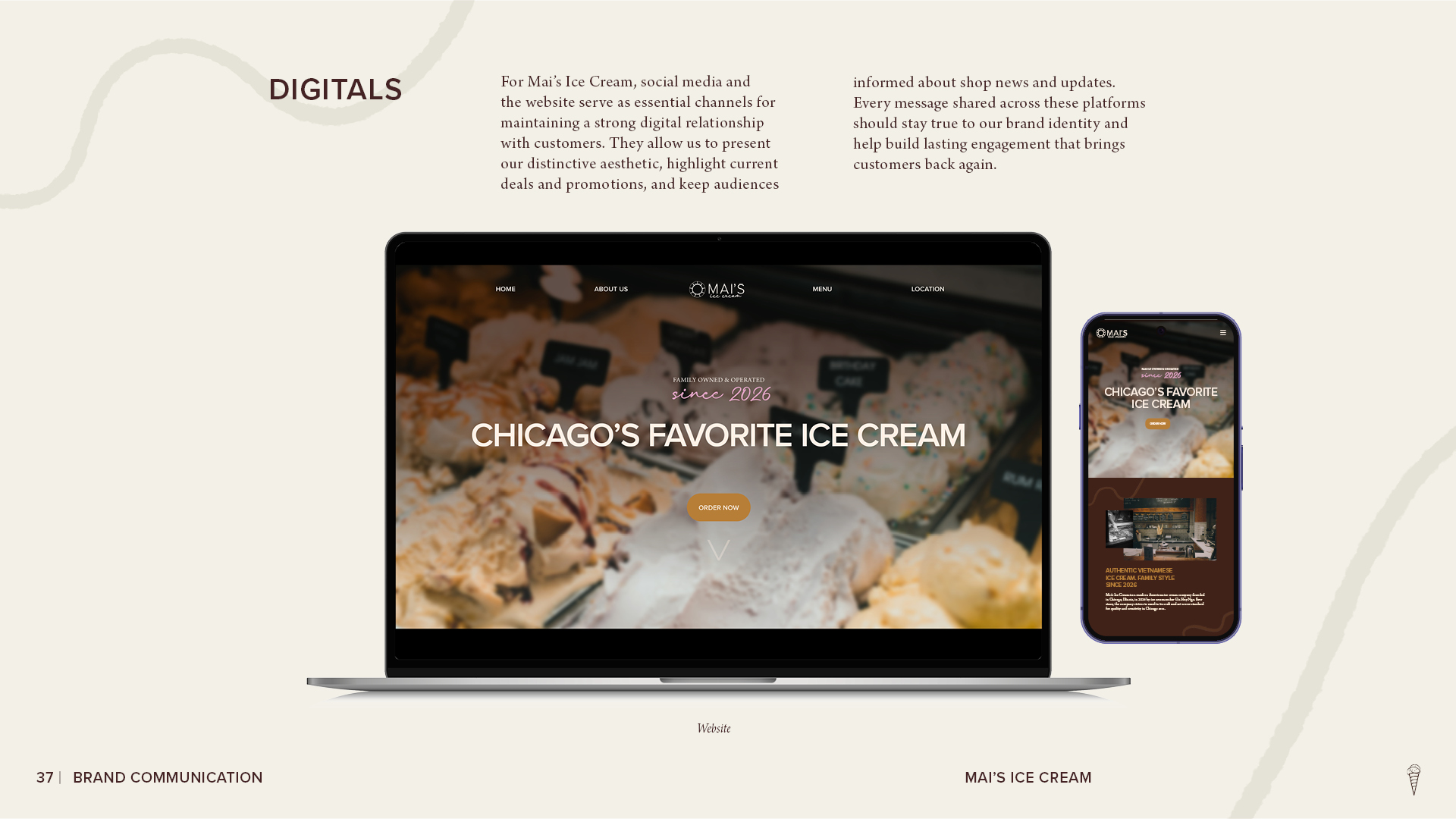
Mai’s Ice Cream digital brand application page showing responsive website designs displayed on a laptop and smartphone, featuring ice cream imagery and brand messaging.
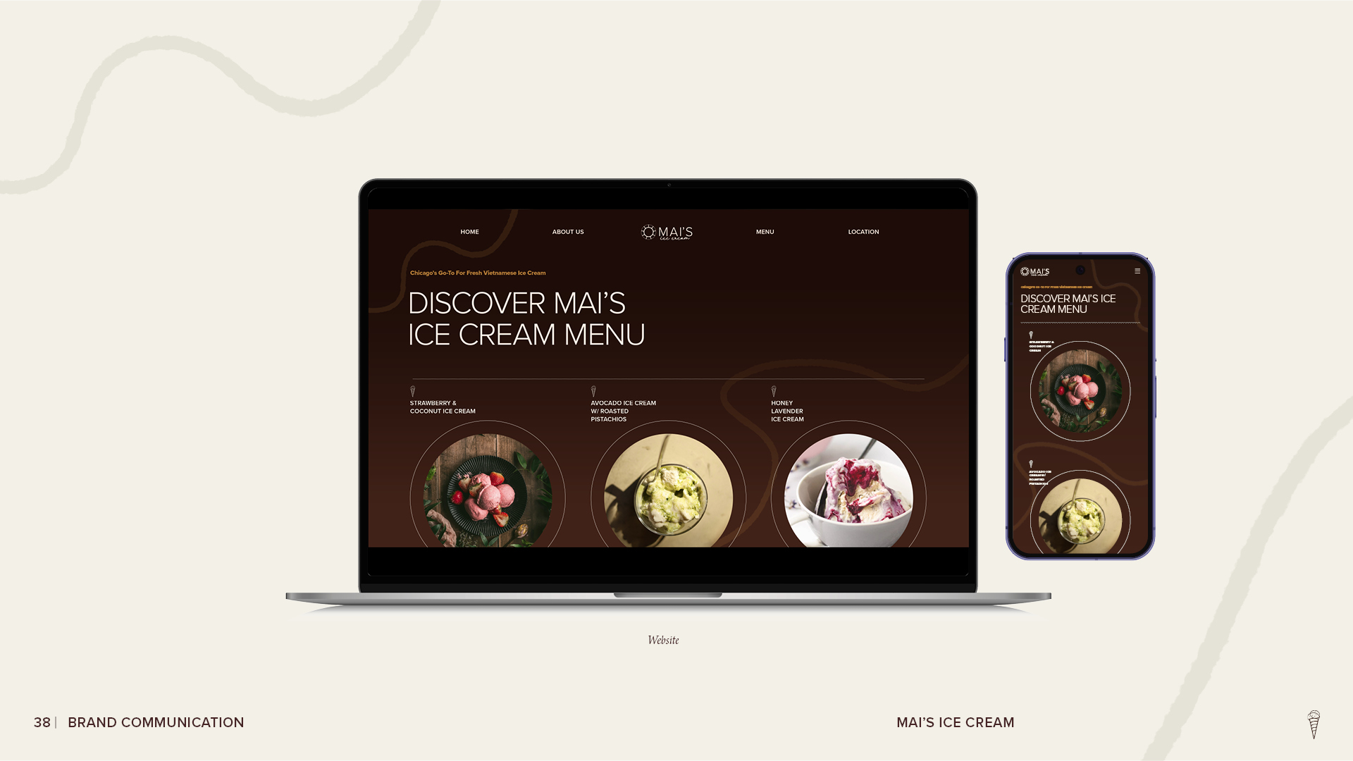
Mai’s Ice Cream responsive menu page shown on laptop and smartphone mockups, featuring branded brown layouts and photos of strawberry, avocado pistachio, and honey lavender ice cream.
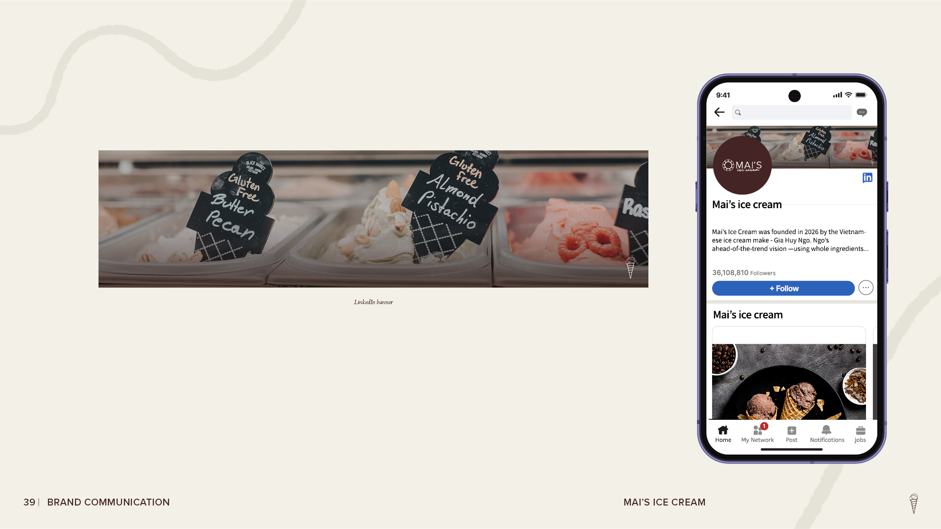
Mai’s Ice Cream brand communication page showing a LinkedIn banner with gelato flavors and a mobile LinkedIn profile mockup featuring the brand logo, company description, and promotional imagery.
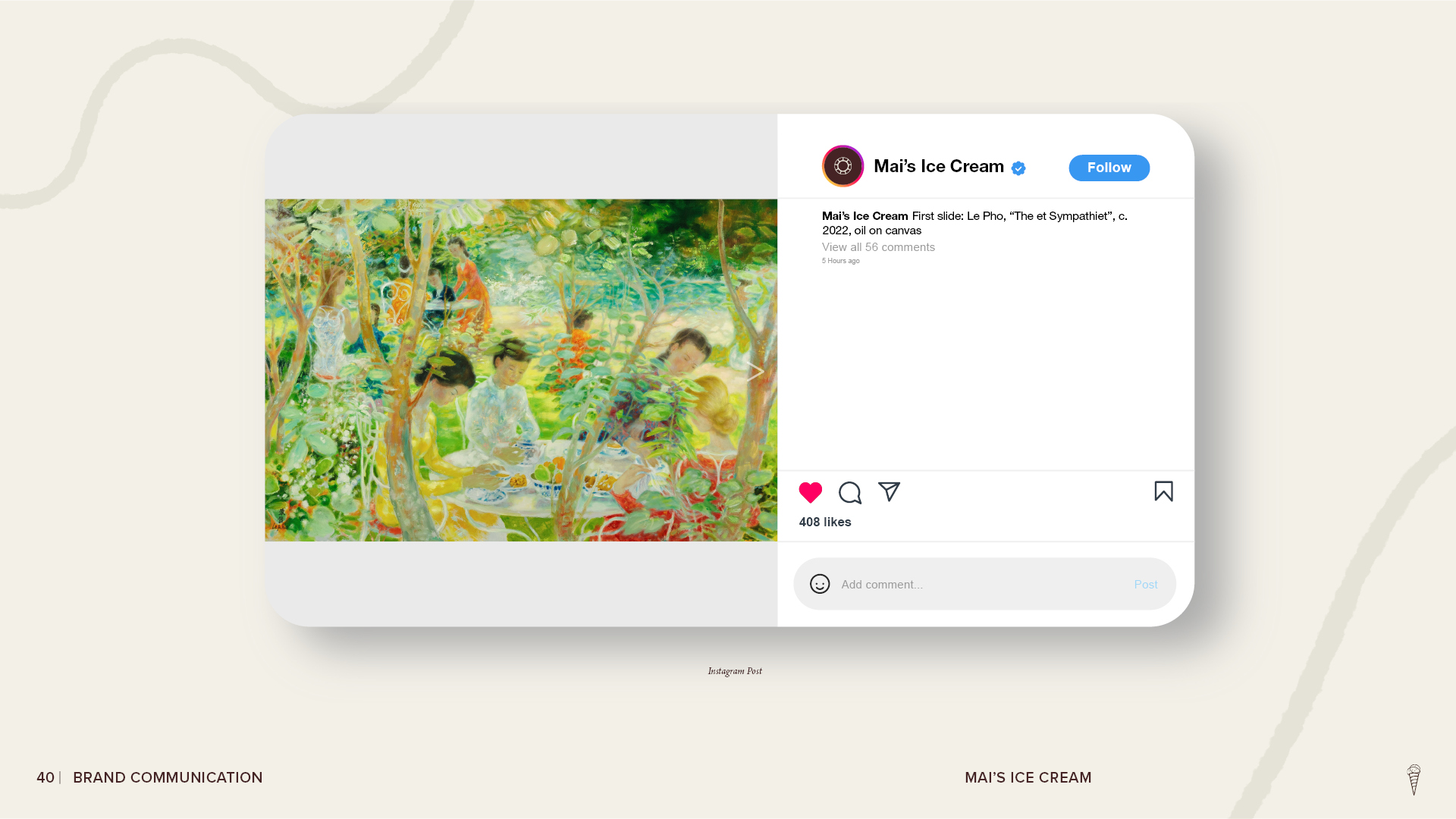
Mai’s Ice Cream Instagram post mockup featuring an artwork image, branded profile identity, caption, and social media engagement elements.
Closing page of the Mai’s Ice Cream brand style guide featuring the words ‘The End.’ centered on a dark brown textured background.

Gia Huy Ngo @ 2026